Featured Map March 2018
http://www.humaneborders.info/app/map.asp
It’s not the kind of map anyone wants to look at too closely. But the Arizona OpenGIS Initiative for Deceased Migrants tracks and shares information that’s critically important.
Dr. John F. Chamblee at the University of Georgia created the interactive, searchable map for the group Humane Borders/Fronteras Compasivas.
University of New Mexico Geography and Environmental Studies faculty are interested in these types of maps, which can powerfully convey information that might otherwise get lost in charts and lists. UNM Geography and Environmental Studies Professor Lindsay Smith specializes in forensic DNA, transitional justice, politics, and human rights, particularly in Latin America, and we asked for her thoughts on Chamblee’s map.
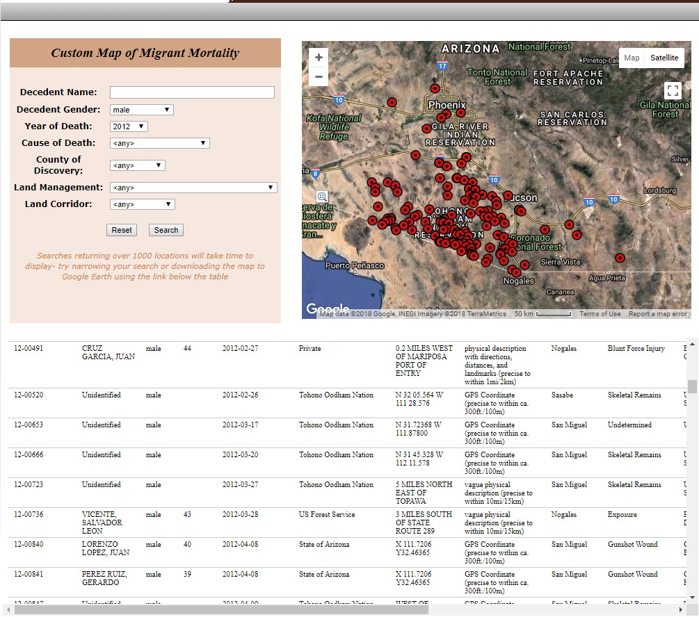
The map offers a good model for how advocacy groups can compile information and collaborate with public agencies, Smith says. Each red dot represents the location of a migrant body, based on records from the Pima County Medical Examiner’s Office, and includes the date of discovery and cause of death. Viewers can also see the migrant’s name, if authorities have identified the body and notified his or her family members. Aside from providing a visual representation of how many people die of exposure or violence when seeking entry into the United States, the map shows where water and beacons might be placed, for example, and where vulnerable people might be found.
And people are using that information to try and help migrants, even as they’re being threatened by law enforcement officials.
Earlier this year, the Border Patrol detained Scott Warren, a volunteer with the humanitarian group, No More Deaths and a faculty member at Arizona State University’s School of Geographical Sciences and Urban Planning. According to media coverage, his arrest--for giving migrants food, water, and shelter--came after No More Deaths released a report alleging Border Patrol agents deliberately destroyed supplies left for migrants crossing the border.
As useful as the map is, unfortunately, Smith explains, it tells only part of the story.
As troubling as it is to see the spread of deaths across the Sonoran Desert, the map only shows the bodies found north of the U.S./Mexico border--and only those found in Arizona, and not California, Texas or New Mexico. Because most agencies don’t share their data, the map reflects the piecemeal way we are responding to the tragedy of migrant deaths, Smith says.
Since 2001, more than 2,100 migrants have died in Pima County, Arizona. Meanwhile, in California, for example, the bodies of migrants are not identified. And in Mexico, 110,000 people have disappeared since 2006. “They started their journey in Mexico,” Smith says, “and were never heard from again.”
Smith also points out that the southern Arizona map is only one of growing cartographic attempts to make border-related humanitarian issues visible. The Missing Migrants Project tracks fatalities worldwide, including refugees and asylum-seekers who have died or gone missing.
